How does different types of data classification influence interpretation of maps?
Depending on the classification method chosen, data can be represented in different ways visually; this may result ultimately in different interpretations of the data.
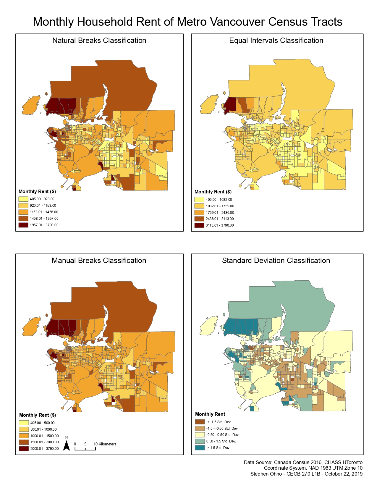
The natural breaks data classification method seeks to create data classes by looking for natural breaks in the data and creating groupings based on this. This will often in a more error-free visualization, although could pose problems when comparing maps, as they may have differently determined natural groupings, resulting in different ranges for their data classes.
The equal intervals data classification method creates even classes by dividing range of the data set and dividing it by the desired number of classes. As this method only deals with overall data set numbers like the minimum and maximum, it does not take into consideration distribution, and can sometimes result in empty classes. As such, it is best used for uniformly distributed data without extreme outliers.
The manual breaks data classification method allows for the map's creator to determine the class breaks freely. This permits the author to highlight certain data, and leave out other data as they see fit, which can be misleading to readers who may not have all the information and context when viewing the map. This method can be useful when creating a map for a more general audience and it is desired to create easily understandable classes that have distinct, specific class divisions.
The standard deviation data classification method is utilized by determining the mean of a data set and then adding or subtracting a deviation from this number. This method works best with normally distributed data, but can sometimes be challenging for a reader to understand than other classifications. When used, standard deviation is usually paired with a diverging colour scheme, featuring a "neutral" colour representing the mean, and more distinctive colours growing in intensity as data moves in either direction away. In terms of this map of Vancouver rent costs, without close inspection, the colour scheme might suggest that certain areas may have a more favourable rent level than others, even though this is not necessarily the case. Standard deviation is thus best used when it is necessary to show both positive and negative deviation from a determined mean value.
What does this data represent?
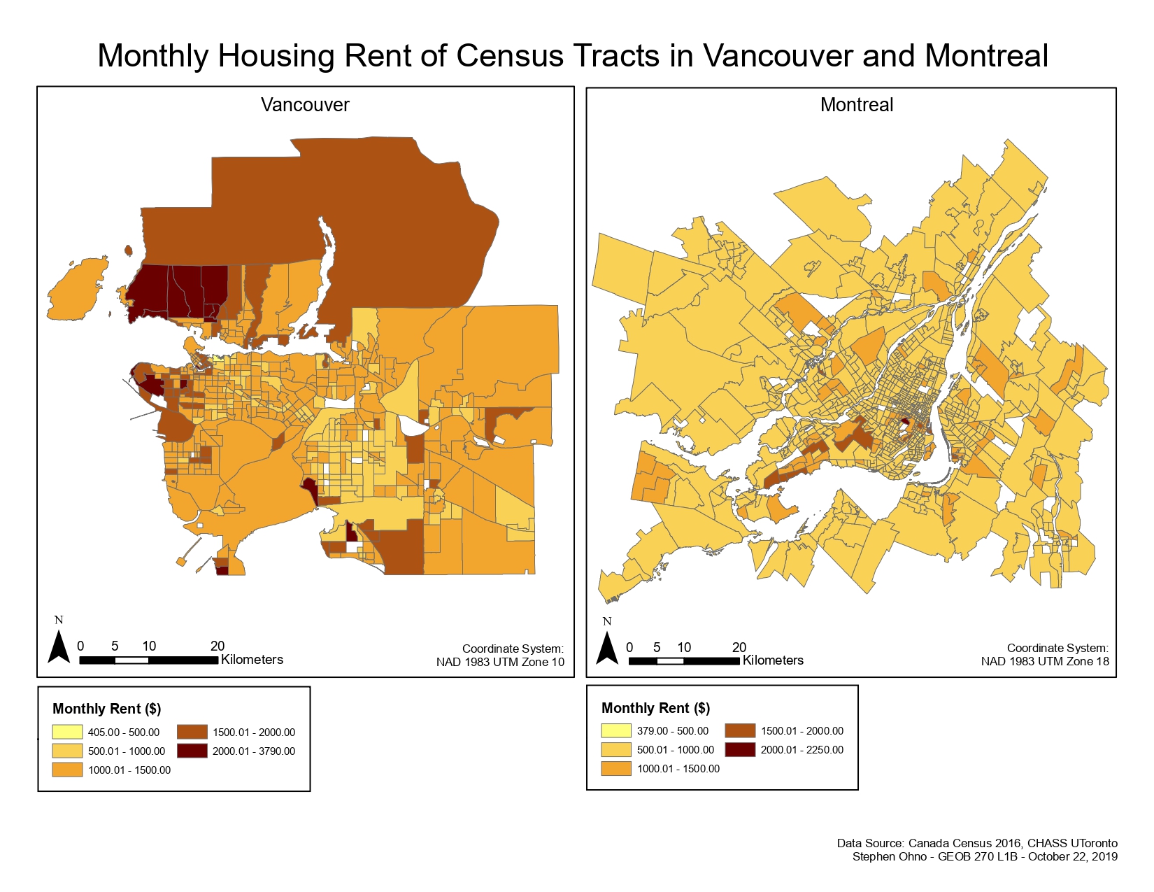
The housing rent data for this map showing both Metro Vancouver and Greater Montreal was from the 2016 Canadian Census. This was joined to census tracts for both areas, which was sourced from a census boundary file obtained on the CHASS Data Centre, operated by the University of Toronto. The variable displayed is the monthly median shelter costs for dwellings in Metro Vancouver and Greater Montreal, with greater costs indicated by a colour of darker intensity, and vice versa for lower costs. Some areas in this map have have none, or not enough residents recorded on the census, which results in their data being suppressed by Statistics Canada. It is also possible that these areas have no specific rental housing, which would also prevent them from being included in this data set. In terms of error, there is the issue stated above of certain parts of both cities having no data available to analyse, which may not provide an overall accurate representation of the variable. Also, the data makes no distinction as to the sizes of the dwellings being analyzed, which could also be a way to explain some of the variability in the costs.
What is affordability measuring?
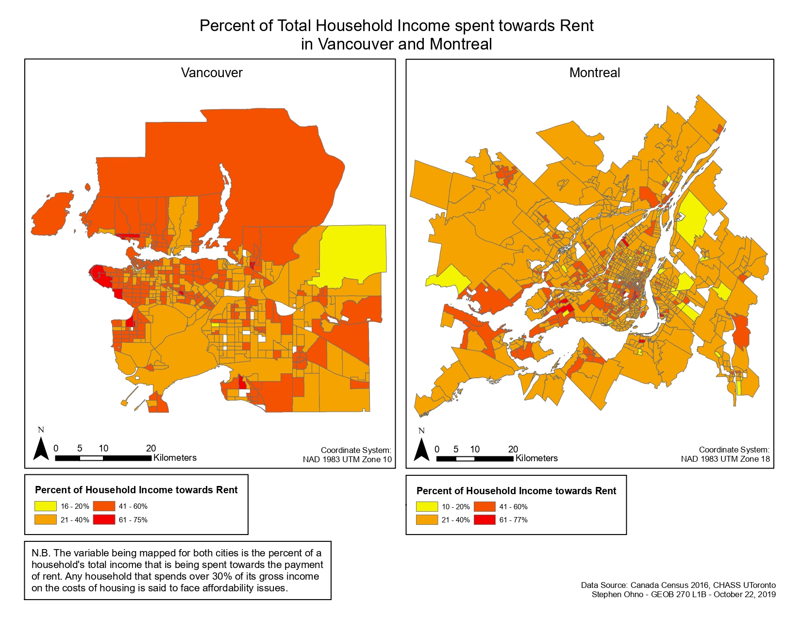
In this case, affordability is measuring the percentage of households that spend 30% or more of their household income on rental costs. As this measures the proportion of household income (including all earning members) that is being spent on rent as opposed to simply the rental cost alone, I believe that it is a better representation of shelter affordability in the end. It is true that poor housing affordability can negatively affect residents' abilities to carry out activities and their work, which in turn can drive them away from the city, potentially limiting their career and life opportunities as a result. However, as for "affordability" being an indicator of city's livability, it is merely but one of several different factors that are at play, which include transportation access, quality of education, and healthcare service among others.
Learning Significance